

The unveiling of FC Porto’s 2024/25 home and away shirts by New Balance has certainly set the stage for an intriguing season ahead. As a football blogger, I'm here to delve into the details of these new designs, each infused with elements that celebrate the club’s heritage while pushing towards a dynamic future.
Home Shirt: A Smoky Twist on Tradition
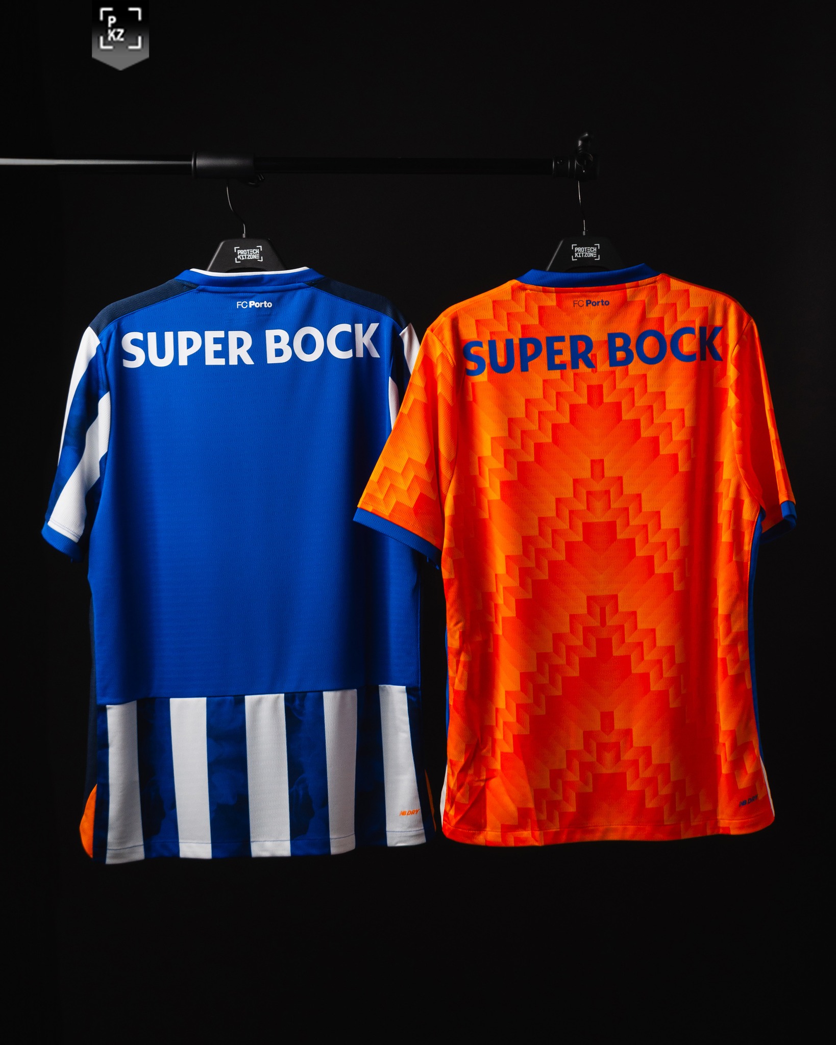
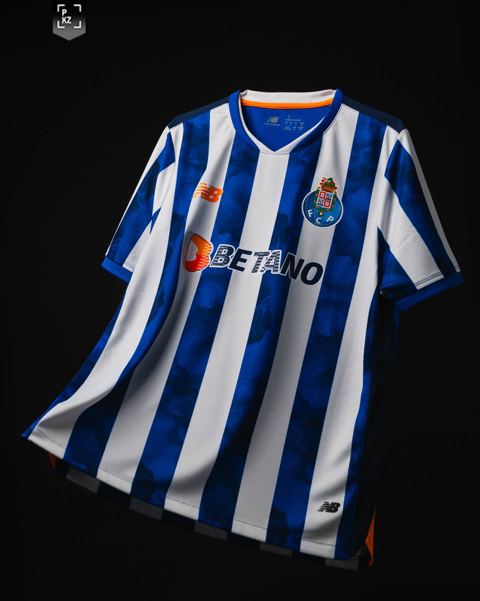
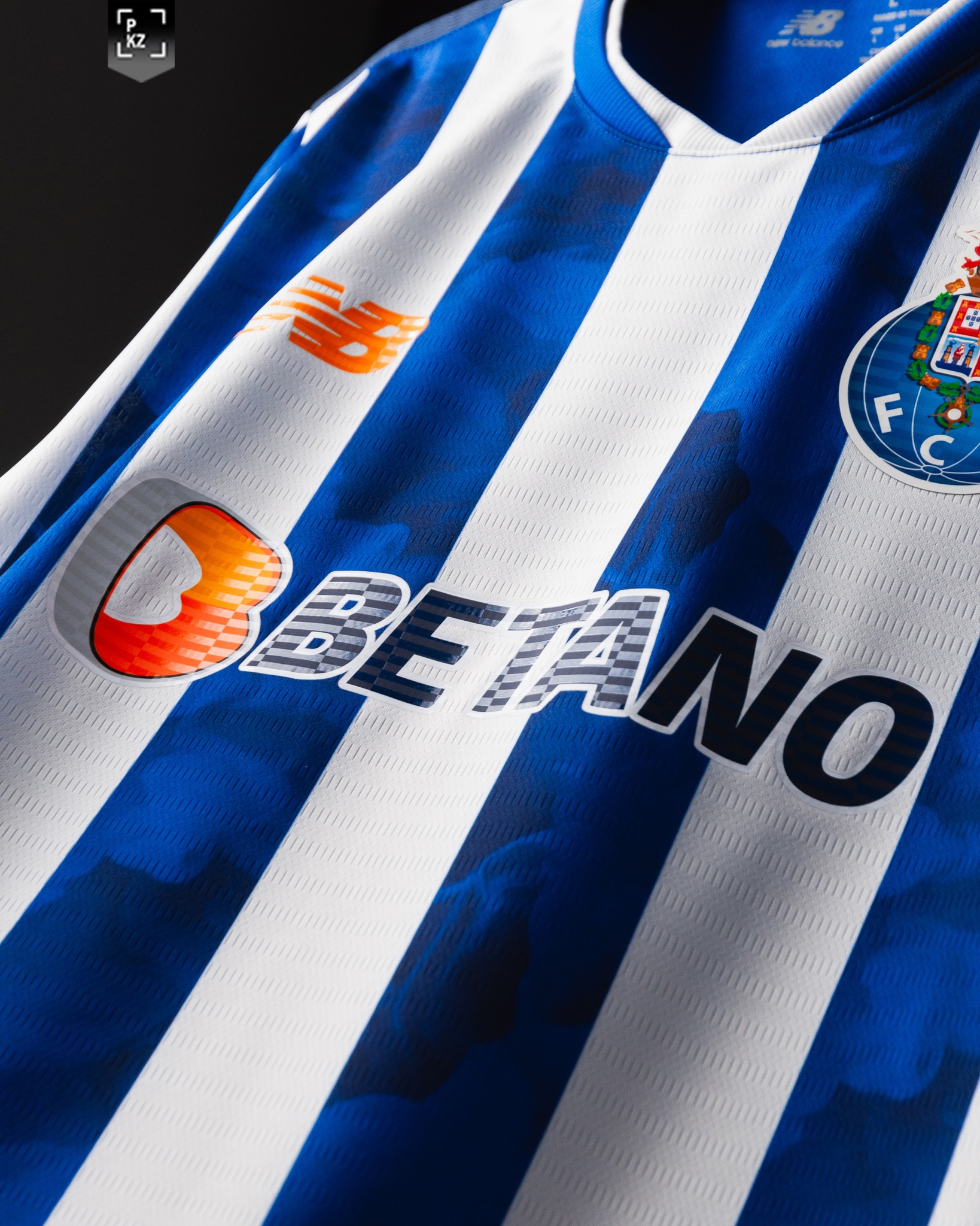
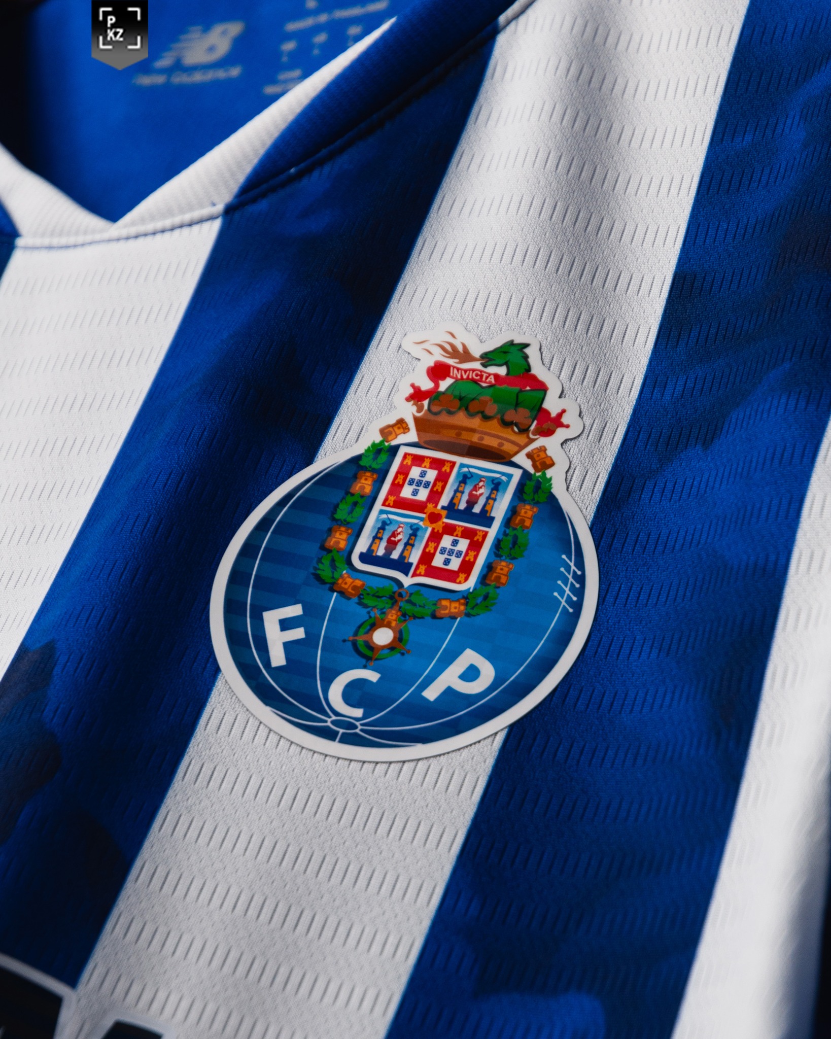
For the 2024/25 season, FC Porto's home shirt stays true to its roots with the classic blue and white stripes, a staple of the club's identity. However, New Balance has introduced a novel twist with a smoky effect weaving through the blue stripes. This subtle yet striking detail is a nod to FC Porto's nickname, the Dragões (Dragons), evoking the mythical creature's smoky breath and fierce spirit.
The shirt combines tradition with a modern graphic element that adds depth and texture to the jersey. This design choice is not only visually appealing but also symbolically rich, reinforcing the club’s connection to the dragon, a powerful emblem of the city and the club. The smoky effect adds a dynamic and almost ethereal quality to the kit, suggesting movement and mystique, aligning well with the club’s aspirations to rise above their third-place finish last season.
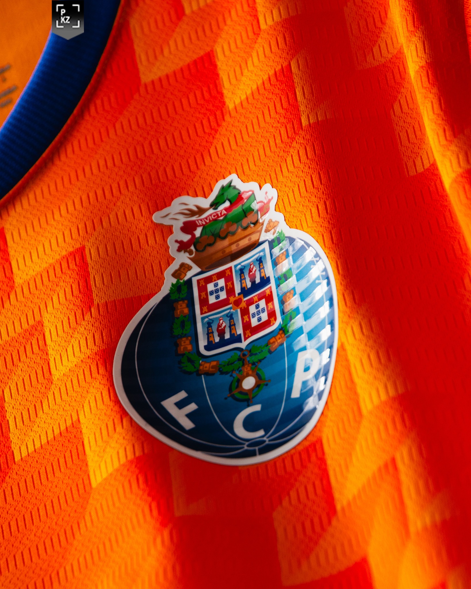
Away Shirt: Fiery and Fierce
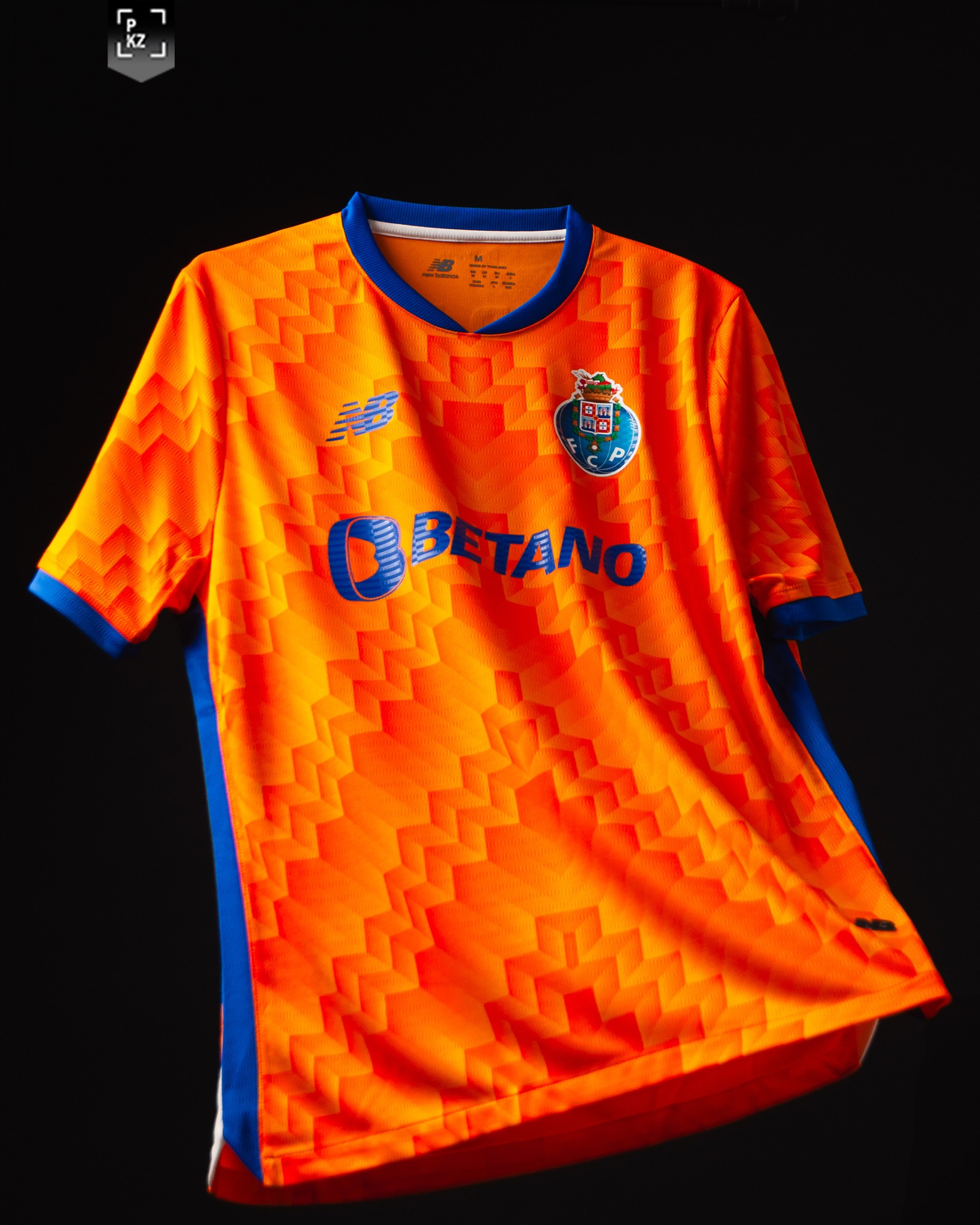
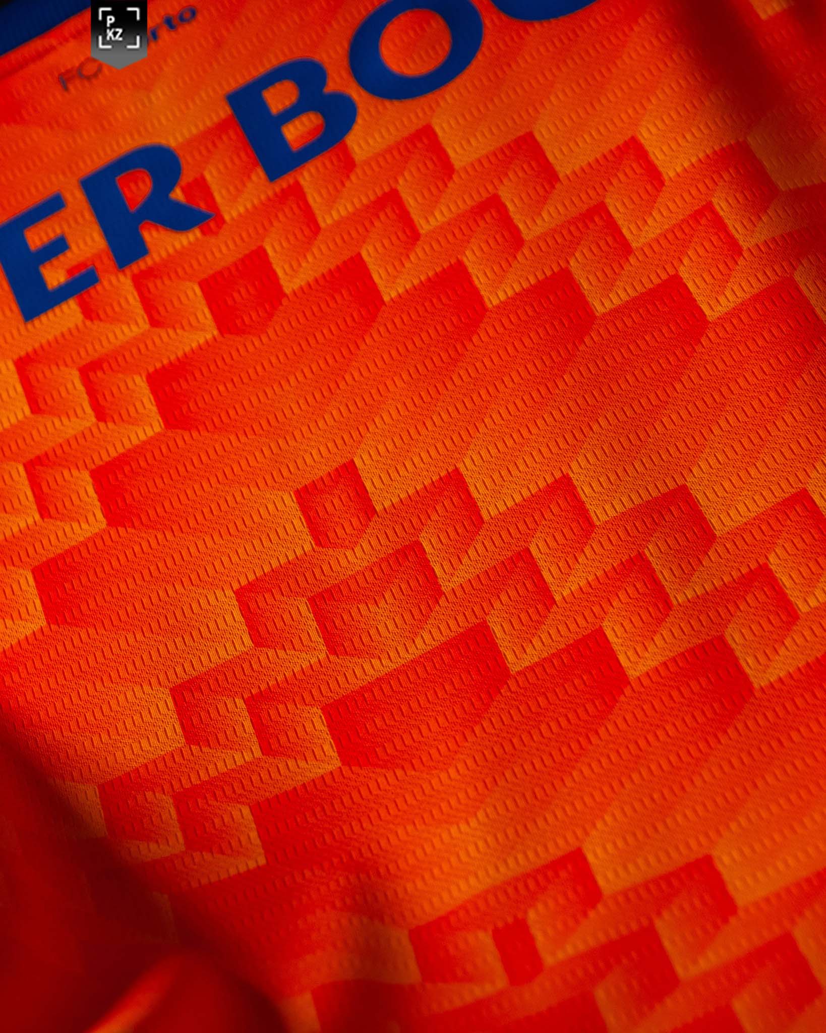
The away shirt for the 2024/25 season brings back the vibrant orange color, a homage to the dragon’s flame, which had previously featured in the club’s kits over a decade ago. New Balance has reintroduced this color to symbolize the dragon’s fiery breath, coupled with a geometric gradient effect in a V-shaped pattern that vividly represents dragon fire.
This choice of design and color is bold and aggressive, mirroring the fierce competitiveness of FC Porto. The orange is striking against the pitch, designed to stand out as much for the players as for the fans. The pattern not only enhances the visual appeal but also embodies the energy and passion that FC Porto aims to bring to every game.
Material and Technology
Both kits likely employ New Balance’s latest in fabric technology, focusing on comfort, breathability, and performance. The materials used are probably engineered to keep players cool and dry, adapting to the intense physical demands of professional football. This technological aspect ensures that the kits are not only symbolic and stylish but also high-performing wearables that can withstand the rigors of a full football season.
Overall Impression
New Balance has done an exceptional job with FC Porto’s 2024/25 kits. The home shirt respects and revitalizes traditional elements with a creative twist that fans will likely appreciate for its symbolic depth and aesthetic appeal. The away shirt, on the other hand, is a bold declaration of intent, visually striking and loaded with symbolism.
These kits represent a blend of heritage and modernity, perfectly encapsulating the spirit of FC Porto as they look to ignite their season with the same fiery determination that their new kits so vividly symbolize. Whether on the home turf or away, these jerseys are set to make a statement in the Liga and beyond.
Related Products

Leave a Comment